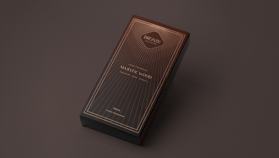
Three Things You Must Check in a Packaging Print File

The quality of the print on packaging depends on a correctly and professionally prepared print file. Below are three essential elements that you must check before submitting your packaging design for production.
1. Convert Text to Outlines
Open or editable text layers in the packaging design can cause significant problems. If the producer does not have the fonts used in your design, the text may be printed with an entirely different font, or special characters with diacritical marks (such as accents, cedillas, or macrons) may not be printed correctly. Convert all text to outlines to avoid font-related errors and ensure the design is printed exactly as intended. In Adobe Illustrator, you can check if the text has been converted to outlines by selecting the text and choosing “Type” > “Create Outlines.”

Tip: In the packaging design, double-check small-sized text to ensure that the information remains legible. According to EU regulations, a minimum text height of 1.2 mm is recommended for most product categories.
2. Color Mode: CMYK
Many design files are often set to RGB color mode, which is a common mistake since RGB is used only for digital screens. Packaging printing is done in CMYK color mode. In your submitted packaging design, all elements, including images, logos, and text, must be converted to CMYK to avoid unexpected color shifts. Only CMYK ensures that the colors will be accurately represented in print.

Tip: If your packaging design requires specific brand colors, use spot colors such as those in the Pantone Matching System (PMS). However, include Pantone colors only if the producer has accounted for the additional cost of these colors in the job estimate. You can also consider converting Pantone colors to CMYK to avoid increasing production costs.
3. Bleeds
Bleeds in the packaging design refer to the print area that extends beyond the cut line (the edge of the package). Bleeds ensure that there are no unprinted white edges on the packaging, even if there is a slight deviation during the cutting process. This is especially important when the design contains background colors, patterns, or images that should cover the entire surface of the package up to the edges. The bleed size must be no less than 3–5 mm. Additionally, make sure that important design elements, such as logos and text, are kept at a safe distance from the package edge to prevent accidental trimming. The standard safe zone for packaging is 5 mm from the edge, and for small packages, it is 3 mm.

Before submitting your design for production, make sure to check that:
- Background colors, patterns, and images extend beyond the cut line;
- Important design elements are placed at a safe distance from the package edge throughout the design.
Submitting a print file in CMYK color mode, with text converted to outlines, and properly applied bleeds will ensure that your packaging is printed with precision and professionalism. Moreover, by submitting a correctly prepared print file, you save both your and the producer's time, which would otherwise be spent correcting basic design errors.